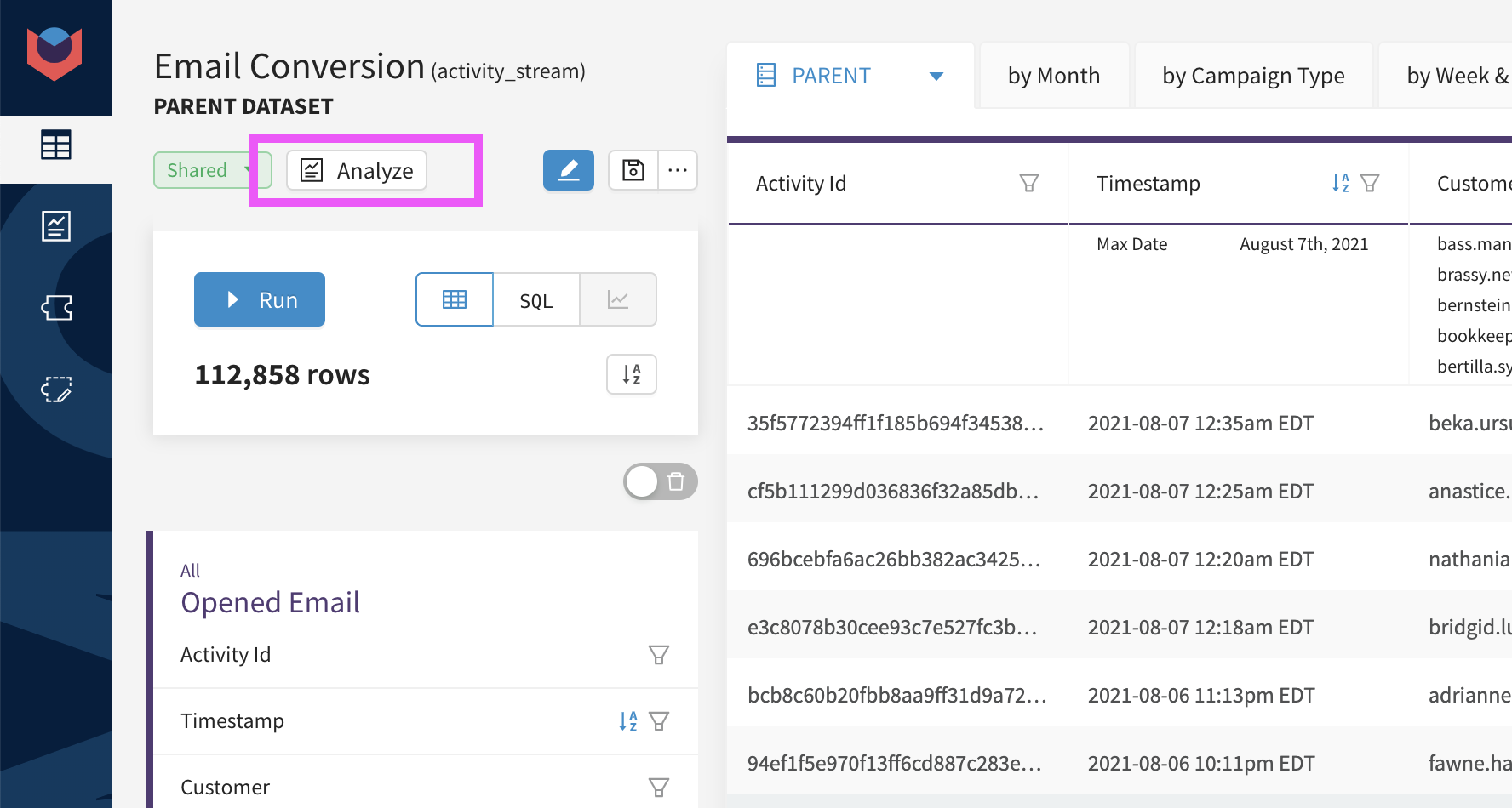
Analyze Button
Auto-generate analyses from any dataset
Using the analyze button, you can understand how any feature is influencing any KPI from your dataset. It will assemble a comprehensive analysis that provides concrete recommendations alongside a story to tell you why your KPIs are influenced by each feature.

How it works
All good questions start with a hypothesis. Using the analyze button, you can instantly generate an analysis to test any hypothesis of the form:
"How does feature X influence my KPI?"
For example...
- "How does viewing the promo banner influence site conversion?"
- "How does the first product you purchase influence retention rate?"
- "How does the number of support tickets submitted influence churn rate?"
- "How does using a discount code influence average order value?"
1. Start from any dataset, and press analyze
Start from any dataset including the data for your KPI, and any feature you want to analyze the impact of. There's no need to create aggregations - as long as the parent data is available the Analyze button will do the rest.
2. Choose your analysis inputs
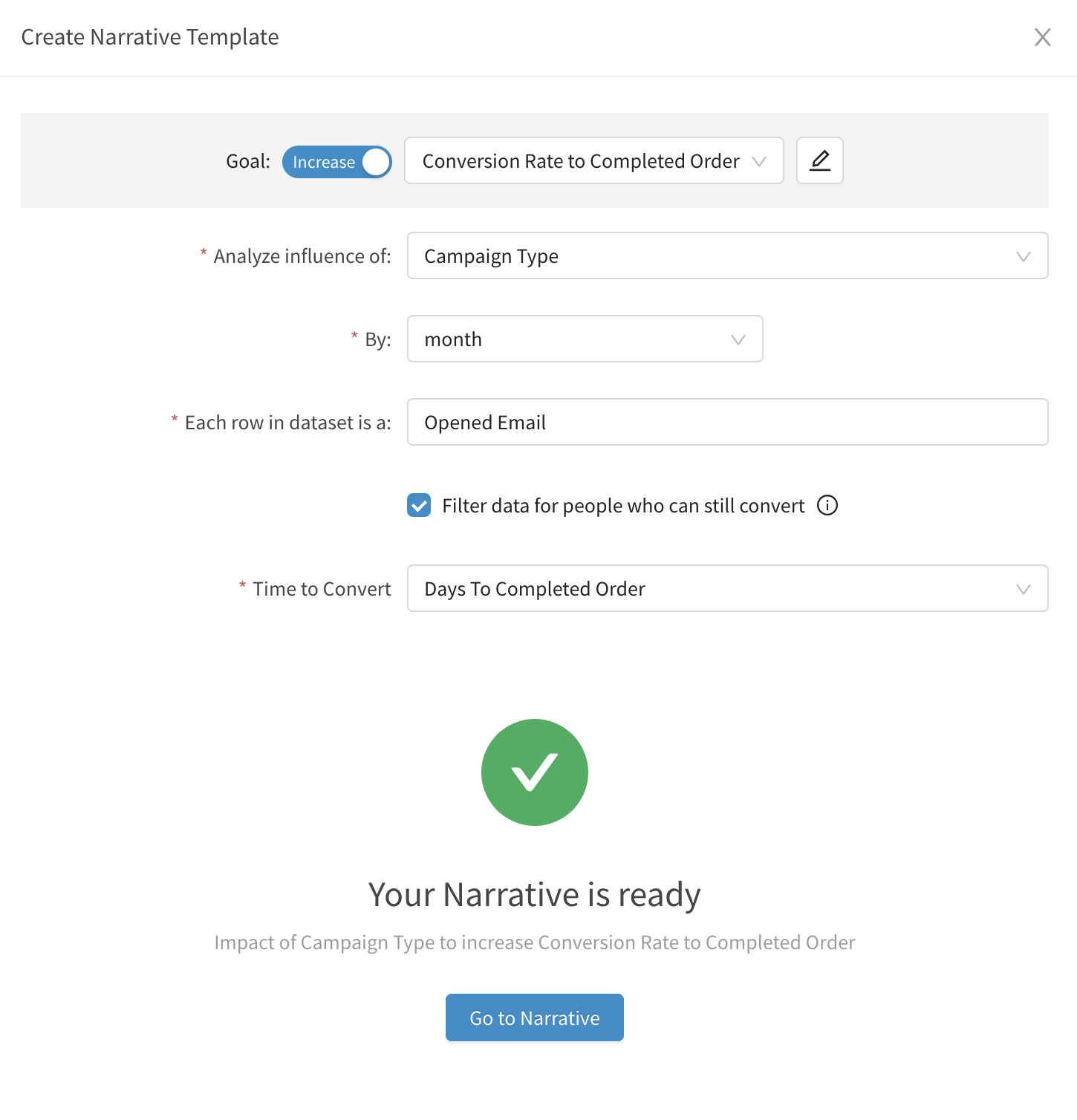
Use the dropdowns to select the inputs from your analysis. The drop down options come directly from the dataset you're working in.

| Analysis Input | Description |
|---|---|
| Goal: Increase/Decrease | Direction of the KPI that represents a good outcome. Ex. Increase conversion, Decrease churn |
| Goal: KPI | The KPI you want to optimize (increase or decrease). The options in the dropdown are the KPIs that can be generated from your underlying dataset. Optional: You can use the pencil to rename the KPI so that it shows up with consistent terminology in the final analysis. |
| Analyze Impact Of: | Feature you'd like to explore how it influences the KPI. It can be numeric, categorical, or boolean (0/1). The options in the dropdown are based on the columns in the underlying dataset. |
| Each row in dataset is: | Label used to represent each record. Used for descriptions/titles in the analysis. |
| Filter data for people who can still convert | If checked, the analysis will assume there is a delay between the starting conversion activity and when the final conversion happens, filter out the records that still need more time to convert, and adjust the analysis time frame accordingly. |
| Time to convert | The column that represents the time it takes for someone to convert from the beginning conversion activity to the final conversion activity. Used to filter the data in the analysis. |
How to: Auto-generate an Analysis
Watch this step-by-step tutorial to learn how to auto-generate analysis with the analyze button.
3. Run Analysis!
This will automatically generate a full analysis based on your dataset, automatically creating the aggregations needed and building a story to explain how your feature impacts your KPI and what you should do about it.
How to: Understand the Analysis Results
Watch this step-by-step tutorial to see the steps of the analysis and how it leads to the recommendations made.
Need Help?
Our data team is here to help! Here are a couple ways to get in touch...
💬 Chat us from within Narrator
💌 Email us at [email protected]
We love to hear your thoughts and feedback. We're always making our product better, so please reach out if you have any comments!
Updated over 3 years ago
