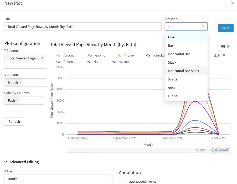
New plots are here!
Scatterplots, donut plots, and funnel plots ... oh my!
We are excited to announce the addition of new plotting features in Narrator! With this update, you can now create pie charts, area plots, scatterplots, and more, in addition to the existing visualization options. These new features will allow you to better analyze and understand your data, making it easier to identify patterns and trends.
In addition to the new plotting features, we also allow for customization of plot colors, labels, and other visualization parameters to better suit your needs.
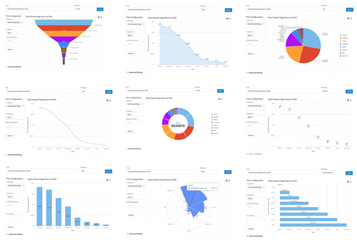
Variety of Visualizations Available
Supported Visualization Types
You can find the new visualization types within Narrator's plotting capabilities.
- Line
- Bar
- Funnel
- Horizontal Bar
- Stack Bar
- Scatter
- Area
- Rose
- Pie
- Donut
New Plot Types
Advanced Customization
You'll now have the ability to personalize your plots to better suit your specific needs. This means that you can easily modify the colors and labels of your plots, along with other parameters, to make your graphs more representative of your data. With this additional functionality, you can be confident that your data is being presented exactly as you want it to be, with all the necessary details and highlights that you require.
Added Controls:
- Line Smoothing
- Default Zoom
- Add a Zoom Slider
- Override Theme Colors
- Display Values / Hide Values
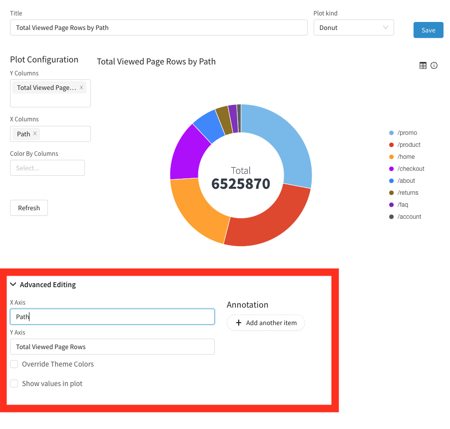
Advanced Controls on Each Plot
Happy plotting 📈
User feedback helps Narrator improve. ❤️
We'd love to hear what you think. Email us @ support@narrator.ai