Instant analysis in our new Metrics Bar
We now show more useful analytical information about your dataset in a new, upgraded Metrics Bar.
Previously, we'd show simple counts and statistics about the current column. Now we're taking some of the same technology from our Analyze Button and automatically adding it to datasets.
For certain metrics, like conversion rates, we'll automatically show which group performs the best along with info about statistical significance.
Here's what it looks like
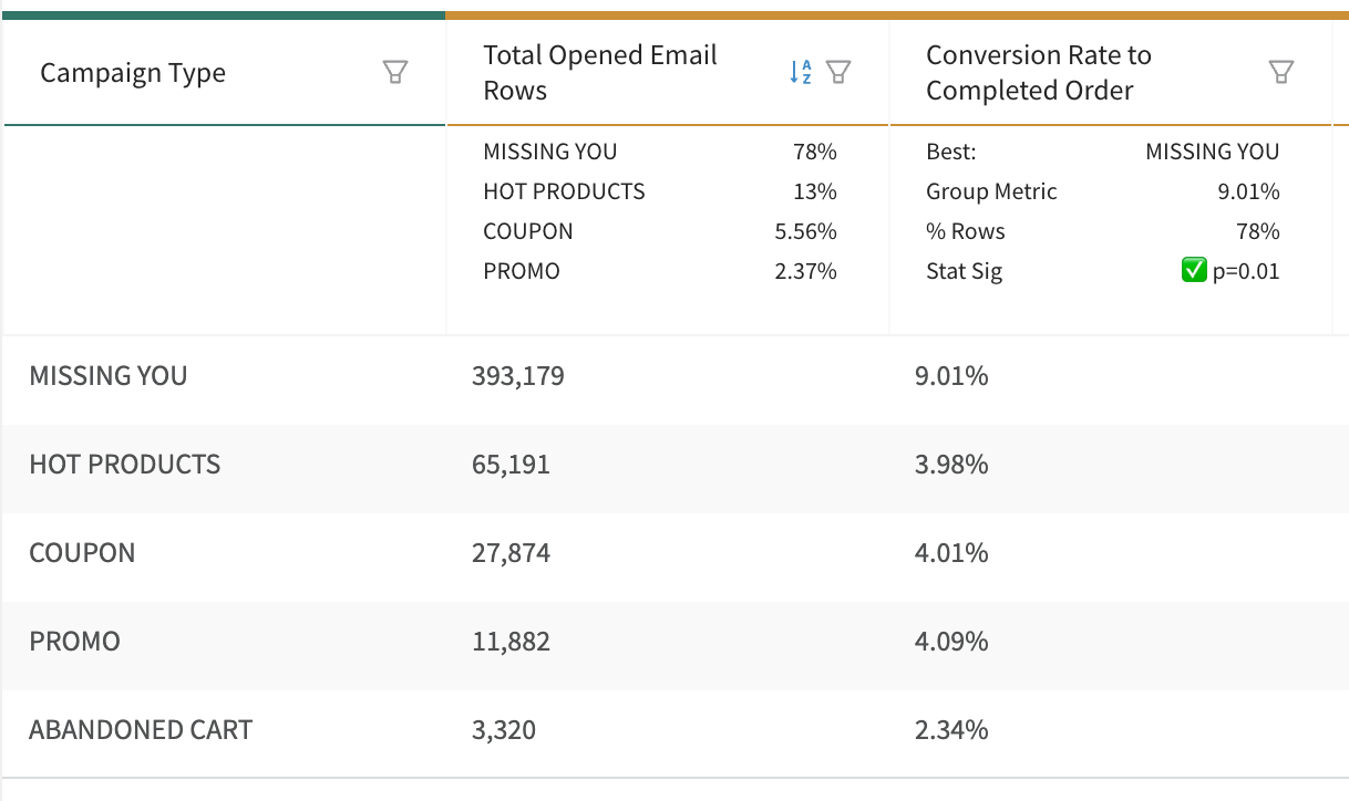
The Conversion Rate to Completed Order column has a mini analysis below it
It shows that Missing You has the best conversion rate, that in terms of total opened emails it's 78% of the total, and that the fact it converts better is statistically significant.
What Does It Show?
The mini analysis is based on your group column and type of metric column
| Group Column | Metric Column | What We Show |
|---|---|---|
| Text or Number | Number | Percent of total for each group |
| Rate | Which is best with statistical significance | |
| Time | All | Trends - start, value it's trending to, and rate (slope) per period |